Overall Training Challenge:
This was the first time the client’s Phase 3 pivotal data was to be presented. It was also the biggest conference of the year in this therapeutic space.
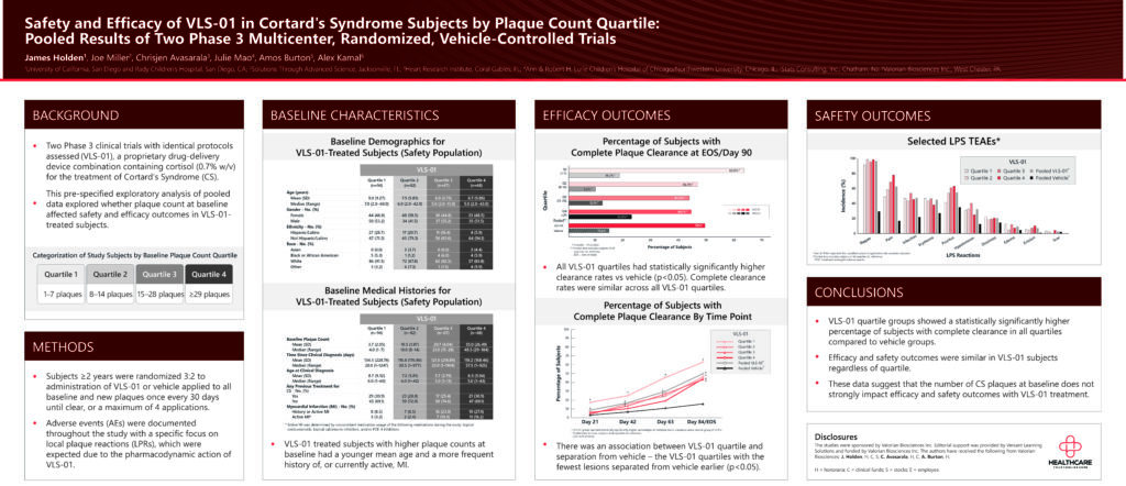
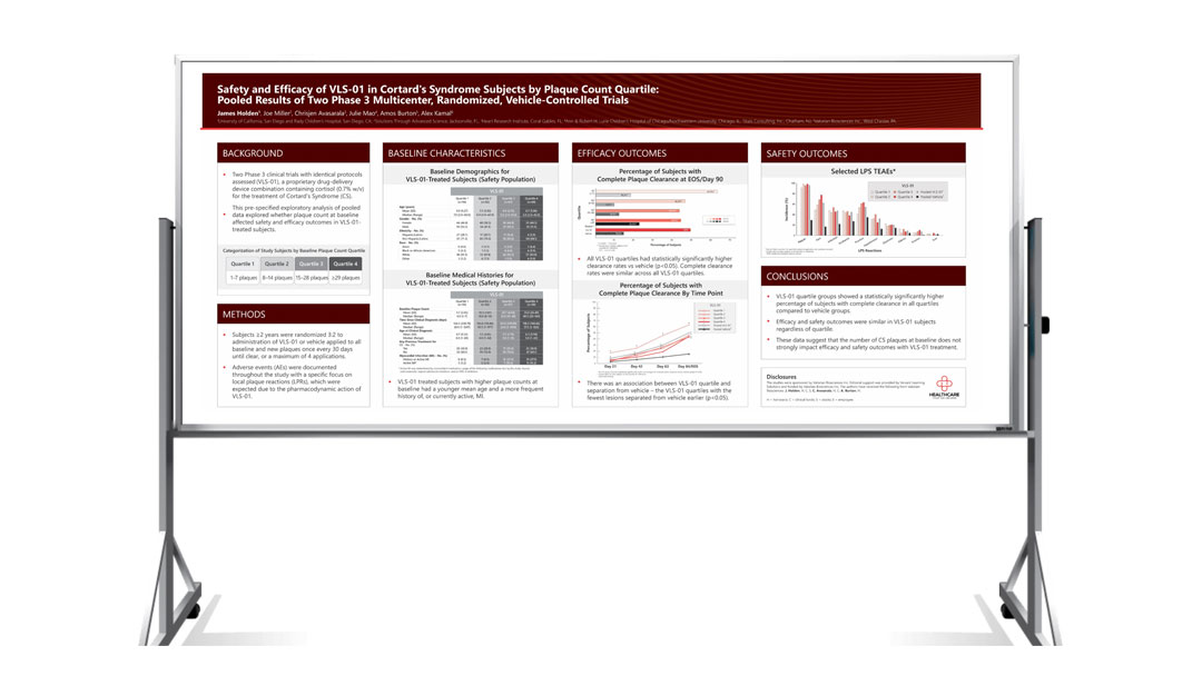
The client wanted the data to speak for itself with well-designed, easily understood, and aesthetically pleasing diagrams. They did not have a poster design in mind and wanted multiple options from which to choose.
Solution:
Using data tables and references (publications) provided by the client, Versant first developed the graphics for the poster. Once the client was happy with the graphics, Versant developed multiple layout options and color schemes for the poster. After those decisions had been made, the text was added, and the design finalized.


